BIANCA MILLER
BRANDING
PACKAGING
ART DIRECTION

The Challenge
The hosiery industry had long defined “nude” with a limited palette, catering almost exclusively to lighter skin tones. This left many women underrepresented, unable to find tights that matched their complexion, and underserved by a market that didn’t reflect their diversity. Bianca Miller herself, struggled to find hosiery that felt truly nude for her skin tone.
The Approach
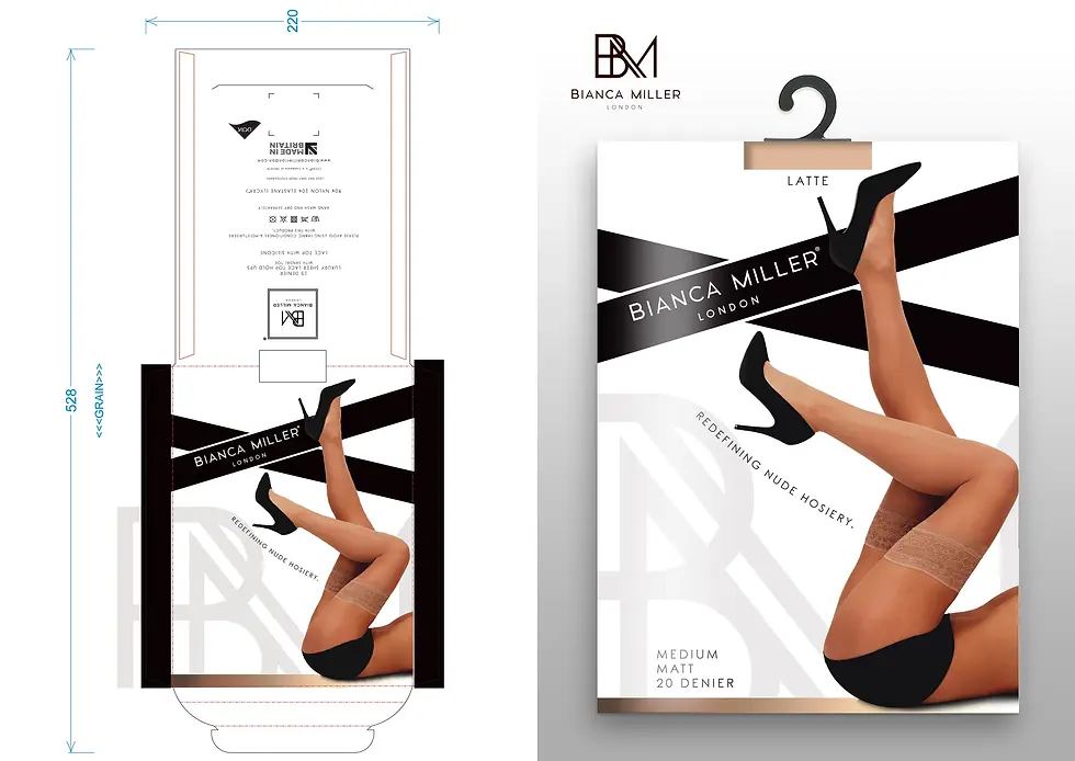
Entrepreneur and BBC Apprentice Finalist 2014, Bianca Miller, set out to disrupt this space by creating a brand that redefined what “nude” means. The Bianca Miller London range was developed to span a spectrum of shades, from English Rose through to Sub-Saharan African, ensuring women of all complexions could find their perfect fit. The packaging design was crafted to reinforce this premium and inclusive positioning: sleek, fashion-forward, and aspirational, while carrying the empowering strapline “Redefining Nude Hosiery.”
The Result
The packaging design reflects a modern, premium aesthetic, sleek typography, clean lines, and strong imagery that celebrates inclusivity and sophistication. With the strapline “Redefining Nude Hosiery,” the brand communicates its mission with clarity and confidence.
The Bianca Miller London range brought a fresh and much-needed perspective to the hosiery market. It delivered a truly inclusive product offering that resonated with a diverse customer base, elevating hosiery from an everyday essential to a statement of empowerment and representation.